2.11.2015
“Is there a ratio between the size of the sign and the ability to read it?

In the past, we’ve written about visibility tips and tricks outdoor signage shops use to make sure the sign’s overall branding is displayed prominently while keeping primary focus on the sign’s call-to-action. We also published a post on outdoor signage visibility tricks to help better express those points. In the post we made reference to a Letter Visibility Chart, which is a great mathematical rule of them for determining letter heights.
Per our feedback, apparently there’s more questions about the chart. It would make sense given all the different variations of letter visibility charts out there. All the charts are close, with little foundational differences which typically cause the variances. Since we're a company who aims to exceed expectations, allow us to further discuss the Letter Visibility Chart.
What is a Letter Visibility Chart.
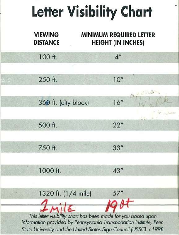
A Letter Visibility Chart is a guide that companies use as a guideline to know how big a letter has to be seen from a specified distance by those with 20/20 vision.
In the picture above you will find a sample of a visibility chart our team uses on a daily basis. As you can see, we use the Helvetica font as the standard for signage letter measurement. Helvetica is a sans serif font and is one of the most used fonts in the world, making it the perfect rule-of-thumb choice to estimate visibility for all fonts. The chart also assumes perfect visibility and during the day.
We also perform calculations depending on the location
Once we learn more about your company, sign design ideas, and the location(s) where the outdoor signage will be installed, we will be able to accurately pinpoint the height, color, contrast, and lighting to achieve maximum availability.
Questions? Contact us today
Our expert, friendly staff will help you come up with the proper mixture of measurements and texture to get your outdoor signage to stand out where it belongs.


